
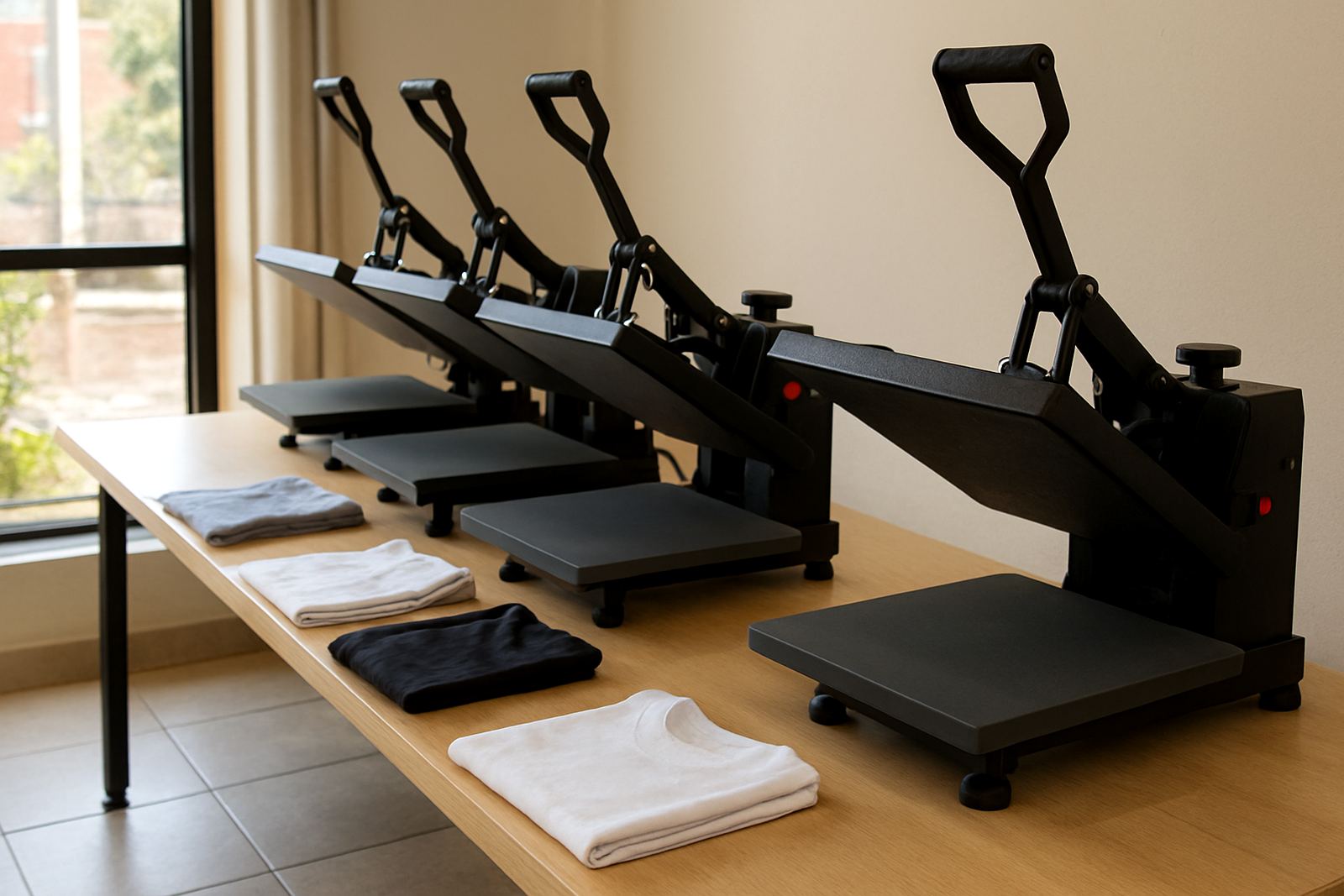
Start with the garment, not the graphic
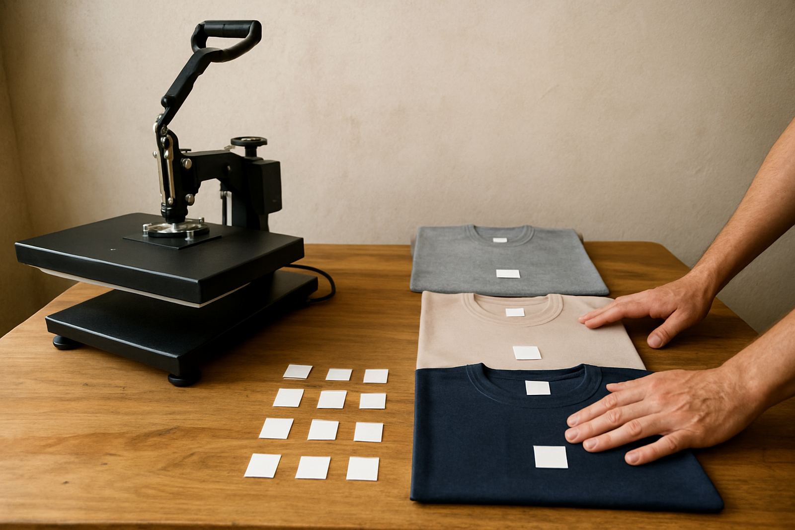
Before you approve any artwork, ask what the garment actually is. A cotton T-shirt, polycotton golf shirt, hoodie, tote bag or workwear jacket all behave differently under heat and pressure. A small front logo may suit a light tee, but the same artwork can look awkward on a large size 5XL garment or on a pocket area with seams nearby.
It also helps to know how the item will be worn and washed. Corporate uniforms need a clean, repeatable placement. Event tees may need faster turnaround and simpler artwork that presses well in batches. For school wear, you often need durable placement and enough room for name or grade details without crowding the chest. A good order conversation should cover the garment type, colour, fibre content and whether the client expects a short run or repeat orders.
- Check garment size range before setting final artwork dimensions.
- Confirm whether seams, zips, pockets or buttons will affect placement.
- Match the transfer type to the fabric and the likely wash cycle.
Size choices that look right on the body
Clients often send artwork that looks fine on a screen but too large once it is pressed onto a shirt. On a small T-shirt, a 280 mm wide chest print can sit too low and run into the underarm area. On a larger garment, a tiny logo can disappear. The job is to guide the client towards proportions that suit the garment, not just the file they sent.
As a practical rule, the artwork should match the viewing distance and the purpose. A chest logo for staff uniforms can stay neat and modest, while a promotional graphic for an event tee may be bigger and bolder. For most front chest applications, printers should test the width against the garment width and leave breathing room on either side. That extra space makes the final piece look considered, not crammed in.
- Front left chest logos are often kept smaller for corporate and hospitality wear.
- Main front graphics usually need more space so the design does not sit too high.
- Back prints can carry larger artwork, but should still sit clear of collars and shoulder seams.
Ask the client how the garment will be used
The best artwork conversation sounds simple, but it saves a lot of rework. Ask whether the clothing is for office staff, sports teams, retail sale or a one-off family event. Each use case changes the approval process. A nightclub promo shirt can carry more visual impact. A technician shirt may need a cleaner logo with fewer colours so it stays readable from a distance.
We also ask clients to consider wear and tear. If a garment will be worn in a hot warehouse, at a market in Durban humidity, or during outdoor work in the Pretoria sun, the print must suit tougher day-to-day use. A transfer that works for occasional wear may not last the same way under daily use, especially where washing is not consistent. Clear advice from our team helps clients choose the right option from the start.
- Daily wear calls for simple, durable artwork with clear lines.
- Promo wear can handle stronger graphics and more colour variation.
- Workwear needs placement that will not interfere with movement or safety gear.
Colour, contrast and garment shade matter more than people think
Artwork can lose impact if the garment colour is not considered early enough. White or pale prints on light clothing can vanish. Dark artwork on navy, black or charcoal may need a stronger outline or a lighter base layer. Some clients focus only on the logo file, but the shirt colour can change how the finished item reads from a few metres away.
It is also worth checking how the transfer will sit on textured fabric. On some golf shirts or blends, tiny details can blur visually once pressed. Fine text, thin lines and small decorative elements may need simplifying. That is not about making the design less attractive. It is about making sure the final item is legible and professional in real use, not just on a screen.
- High contrast helps small artwork stay readable after pressing.
- Fine text should be checked carefully on textured or blended fabrics.
- Light transfers on light garments may need extra planning for visibility.
A clean proofing process prevents costly reprints
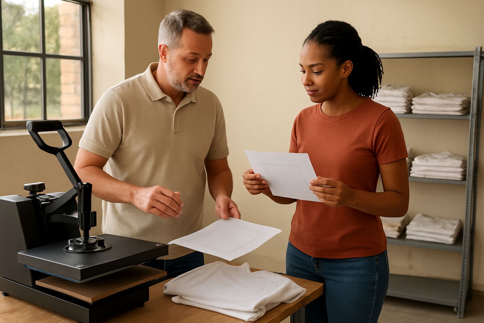
Most mistakes happen when the artwork is approved too quickly. A printer should confirm spelling, size, placement, orientation and quantity before production starts. If the client wants multiple garment sizes, the same artwork may need a few set-up adjustments instead of one fixed setting for everything. That is why a clear proofing conversation is worth taking seriously.
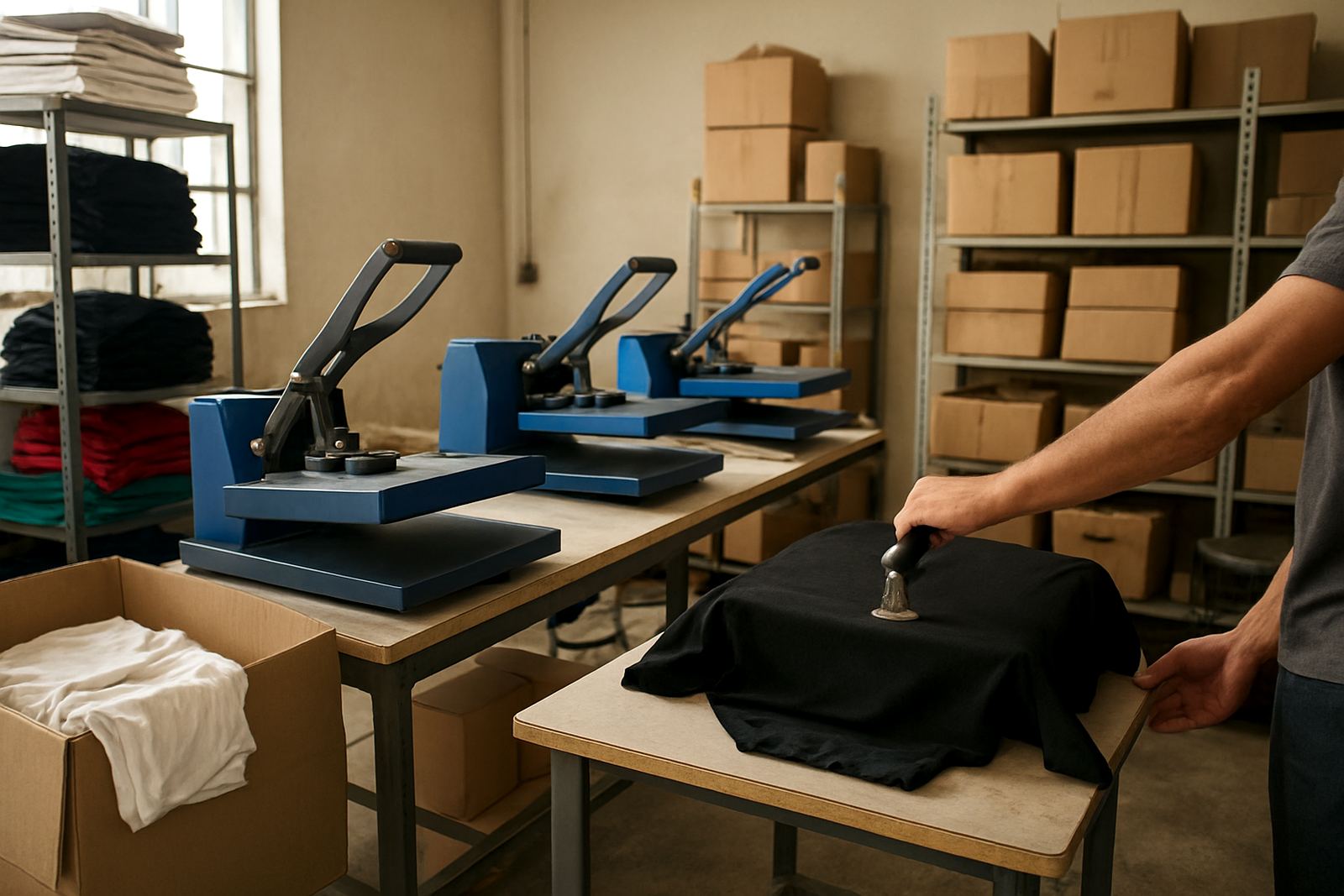
For small print runs, a sample press can prevent a bad batch. It is far cheaper to correct a 40 mm size change on one test item than to rework a full order of 100 shirts. If the order includes mixed garments, ask for a layout decision in writing so everyone knows what was agreed. One missing detail can create a delay at the worst possible moment, especially when a client needs stock ready for an event in two days and the courier clock is already running.
- Confirm spelling, size and placement before the first press.
- Test one garment when the order has mixed sizes or fabric types.
- Keep a written approval trail for repeat orders and quick reorders.
Local order example: getting it right in Gauteng
A Midrand clothing decorator might get an order for 60 staff tees for a logistics client with branches in Johannesburg and Pretoria. The client sends a large front graphic with fine text and wants it on dark shirts. On screen it looks sharp, but once the artwork is scaled to the garment, the small wording becomes hard to read and the design sits too low for the size range. A quick conversation fixes the layout before production starts.
In that case, the better route may be to reduce the front artwork slightly, move the logo higher, and create a separate back placement for the full company name. The printer can then press a sample, confirm the finish and adjust pressure or temperature if the transfer type needs it. That kind of order handling keeps the job moving and helps the client receive shirts that actually suit the people wearing them, not just the mock-up.
For print shops serving Gauteng, and even courier jobs going to Durban, Cape Town or Bloemfontein, the same principle applies. A few practical questions at quote stage can prevent a lot of unnecessary stock handling later. It is a simple habit, but it makes a proper difference to margins and repeat business.
What to ask before the file goes to the press
When a client is unsure, these questions usually bring the order into focus quickly. They also help the printer give better advice without turning the conversation into a long technical lecture. The aim is to make the artwork fit the job, the garment and the deadline.
- What garment type and fabric are we pressing onto?
- What size and placement do you want on the body?
- Will this be worn daily, for an event or for resale?
- Do you need a repeatable layout across different sizes?
- Should the print stay simple for durability or carry more detail for impact?
When those answers are clear, the rest of the job tends to run more smoothly. The proof is better, the press setup is quicker and the final garment looks intentional from the first shirt to the last.